
Data Set and Chart
Link to my DataSet
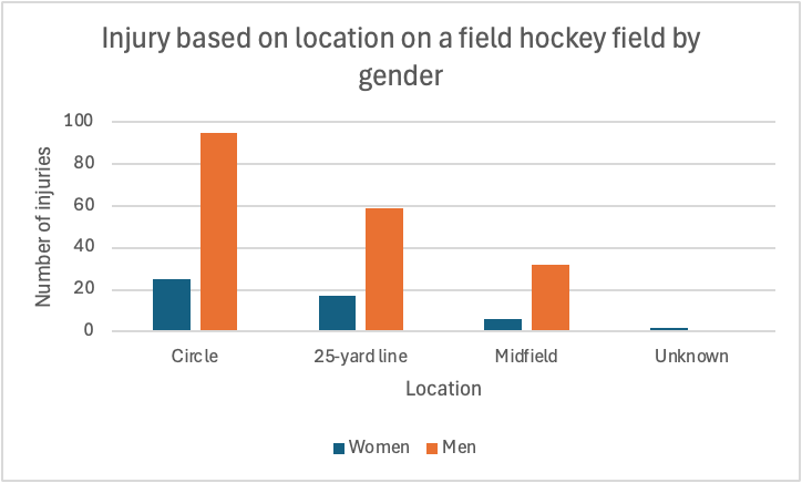
Injury Data of Field Hockey Players
Trend
I noticed that as the players get further from the goal, the injuries decrease. The circle is the place on the field which is closest to the goal, which appears to have the most injuries with men and women. The mid field is the farthest location from the goal, as it appears that is where the least amount of injuries occur.
My Process
After finding the dataset, I copied it into excel. Then, I cleaned up the data, making it look better and more organized. After that, I created the Pivot Table, which displayed the data in a more clear way. Finally, I made a bar graph to visually show the data. These methods helped me determine the trends of the dataset.